The Journey movie plan

After getting some ideas together we split into smaller groups to work on our chosen film idea. I am in a group consisting of 3 people and those people are Me, Sam Kelly and Byron Sullivan.

We had to choose what we would prefer to make a short movie or a trailer.

We have chosen to do a short horror movie that won’t have any dialogue.

The concept for the film is that there is a case happening about a series of murders in a forest, the main character which is a detective is sent to investigate and solve this case, while being in the forest something happens to his sanity.

Below is our Linoit page which we have gathered ideas on, the frst one is from a larger group we had which we just put ideas together and the second one is mine, Byrons and Sams.


Screen Shot 2015-03-20 at 09.17.20 Screen Shot 2015-03-27 at 09.44.58

The Journey project

We have started a new project in class today. It is a short film project under the name “The journey.” I’ll be posting what we are doing in parts so it’s easier to organise and read.

This project entails us to have to work on this movie from the very beginning. Firstly we had to come up firstly with ideas for our movie and we done this on a internet program called Linoit which there is a picture below, for this part we worked in a larger group to get as many ideas as we can, below is a link and picture of the Linoit page.

Screen Shot 2015-03-20 at 09.17.20

http://linoit.com/groups/TheJourney/canvases/TheJourney

Bauhaus menu design

bauhause menu no dishes

In class we have started to design our menu for our cafe, so far i have decided on the colours ill be using and the font. I have decided on only having 2 things on the menu as it will keep the menu looking simple and also because the cafe it self would be a kind of internet cafe. Ill be describing my concept ideas in another post.

Logo work

font for wordpress

Above is one of my ideas for a logo. I tried to make it a simple design and nothing to abstract, i have used cream colour and blue as they are quite simple and calming colours.

Below is how I made the font.

Step one:
Screen Shot 2015-01-12 at 14.48.20
Firstly I have found a font Liked online and imported it into photoshop, after that i have used the selection tool selected the letter H onwards, I have then cut it from the original layer and repositioned it and edited it slightly so it would look like this.
Screen Shot 2015-01-12 at 14.48.47

Step two:
After arranging the letters into the certain order i have decided to add some colour behind the shapes, the way I did that was by using the shape tool on photoshop and then editing it using the different options in photoshop and also using the paint bucket tool to change the colours, after that it looked like this
Screen Shot 2015-01-12 at 14.49.04

After doing that i have kept on doing so while also changing the colours every so often and this is what i got.
Screen Shot 2015-01-12 at 14.49.45

Bauhaus Fonts

We have been introduced to Bauhaus a few lessons ago as this will be our new project that we will be doing.

The first task that we assigned to do was to come up with a font style based around the Bauhaus art style and this is what i came up with these 3 ideas on how i will modify the font.

Bauhaus plain fonts

The first design is just the plain font, I have used the same 6 fonts for each idea, for this on I have just simply stuck the fonts onto a background.

Bauhaus white fonts

The second design idea is replacing the black font with certain colors, I personally believe it is the best out of the 3 designs as there is something appealing about this design to me.

Bauhaus colour and white

The last design is a combination of both of the previous design in the sense where I keep the black font and just outline it with a few colors.

I have created these in Photoshop and i will be going over how i managed to create these in another post.

What have I done so far in Media??

To answer that question I will be just over looking my previous post on WordPress ill be going from my oldest posts to the newest ones.

At the start of the project I have looked into the influences of steampunk in day to day things. I found out that it is mainly used in gaming and CGI and it is easier to create something virtually then it is in real life however when it is created in real life it looks amazing, for example the image below.

Steampunk_Clock_XXII_by_Diarment

Since browsing the internet for ideas on what to steampunk I have came across this.

thegameboysteam

This immediately made me want to do something similar as i just fell in love with this design and I wanted to try and recreate something that will look something like that.

I have had a few failed ideas on Photoshop trying to work out how I would like it to look…… These are the monstrosities that I have came up.

Gameboy steampunk Gameboy steampunk

The Photoshop work was quite bad but once i have started to produce the game boy I had faith restored in me. One thing that has gotten on my nerves was waiting for a tiny screwdriver to start taking my game boy apart. When it arrived I have managed to start.

To keep this brief i have taken the game boy apart, sanded it down a pit, repainted it, cleaned it a bit, dry-brushed it and stuck bits on. Once i was near being finished i have lost one of the buttons for the game boy so i was set back quite a bit…………….. However the button was simply hidden in a box where i used to store it in the first place.

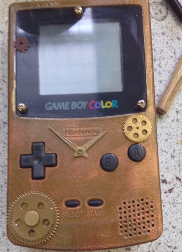
Below are images of my game boy complete.

IMG_8010[1]IMG_8004[1]

I was so happy with the outcome as it looks amazing and it actually looks like a product that Nintendo would release. And because of that i have came up with another idea that i will make a infomercial for this Game boy as we had to do green screen work so i decided to extend it a bit.

Currently i am still doing the After Effects work as i need to adjust a part in it frame by frame for 3 clips which so far i have done about a third for the first clip, below is a screen shot of what im up to so far.

Screen shot of after effect

What i’m doing in after effects

I have spent quite some time on after effects trying to make the tracking work with my footage.

I have had a problem where my footage will end up in the wrong place and rotated in a wrong place.

In the image below shows me trying to sort out the image by hand rather then by having after effects do it for me.

Screen shot of after effect

The blue squares in the middle of the image are the points of which the clip will move too and i need to adjust them manually.

Haven’t uploaded in some time…

I haven’t posted in a long time as i was trying to work out how to use after effects and all i have got so far is this.

wordpress stuffs

So far all i have done with this project was trying to get all the clips in and making sure that they are all in time with each other and after doing this ill be planning to make the green screen for this but ill be having to use a slightly different way to then using a green background.

Adding on the parts.

The time has come for me to stick on the little cogs and other things like that onto my Gameboy.

This was the part I was dreading the most as it was going to be the one that seemed the most fiddly as it involved using the glue gun and sticking on small parts, also a thing that worried me was that if I stuck on the parts and I wanted to take them off I’ll rip of the paint.IMG_3797.JPG

Sadly some of the paint that was originally was on the Gameboy I have ruined so ill need to repaint it to make it look like it did before.